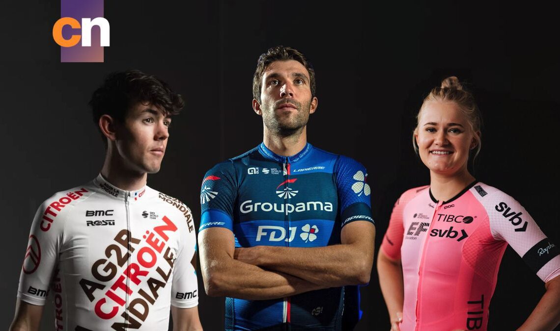
The winds of change of a new season have passed over us, resulting in new team kits for 2023.
Some are familiar, borderline timeless at this point, while others are trying to disrupt and break new sartorial ground with new colours and designs. The branding of the big sponsors will still be filling our screens for the year, but in new and exciting (and sometimes hideous) colour combinations.
Because we’re deeply democratic here at Cyclingnews, all of our writers have marked each kit out of 10, with an aggregate score making up what we are once again terming the ‘definitive’ ranking.
I’ll be passing judgement over each kit (and my colleagues’ wisdom) but to make things more interesting I also asked my mother to weigh in. She makes her own clothes and isn’t scared to speak her mind.
We start from the bottom and work up towards to the team voted to be the best.
Feel free to react in the comments section below, if you think we’ve all got it totally wrong.
This wins my award for “kit that most resembles a haemorrhoid cream”.
The colours and fonts just put me in mind of a pharmacy. Not the fun bit with the hair gel, nor the prescription-only bit, but the bit in between that takes care of those conditions that are embarrassing, but not so much so that you get the privacy of the little paper bag. You have to go up to the till and let everyone else in the queue know you have athlete’s foot.
Will’s Mum says: That is a cheap blue, isn’t it? There are so many beautiful blues, and that’s not one of them.
It’s moderately better than the men’s by virtue of it being a better, darker main blue, but it’s still giving me pharmaceutical vibes and suffers the same problems for it. I don’t like it, and it deserves to be near the bottom of the bunch.
Will’s Mum says: [Refer to what she said about the men’s team]
28. Team DSM
It’s not often I agree with my Mother, but I think she’s got this one bang on. It does look like a football kit to me. Dynamo DSM? It’s also a little too plain, and the general theme (minus the sponsor decals) is very similar to vintage Team Sky. The colours aren’t bad, but if you’re going to make it look like a football kit then go all in like 2015 MTN-Qhubeka. That was a great kit, and it was a joy to watch Alan Shearer a.k.a. Steve Cummings pick up a stage at the Tour de France on Mandela Day.
Will’s Mum says: Oh god that looks like something you’d see…
Click Here to Read the Full Original Article at CyclingNews RSS Feed…

