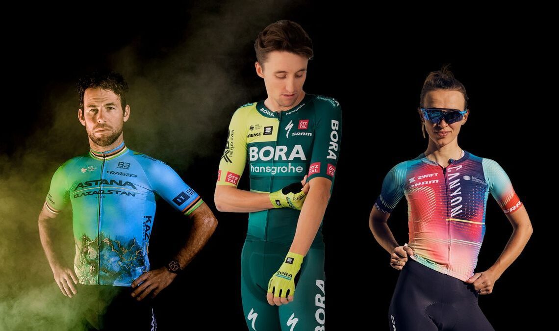
January is relatively miserable, provided you’re in the northern hemisphere. For cycling fans though it means that the WorldTour peloton is now showcasing new tech, new bikes, and most importantly for this article, new kit. The jerseys of the world’s pro cycling teams are now all out there in the wild, and we’ve done our usual mass office vote to bring you the definitive rankings.
There are some big changes, some unusual colour palettes, and new sponsor decals to shoehorn into already crowded visual spaces. While others may claim to bring you an official kit ranking, none offer what I’m bringing you: Scathing comments from my mother.
She is a regular cyclist, but doesn’t pay much attention to racing beyond the Tour de France, so it’s about as objective a viewpoint as you’re ever likely to get. Keep reading to see who ranked where, which teams have moved up and down, and which jersey my mum thinks “looks like a urine sample”.
Rock bottom, but an improvement on last year to my mind. The honeycomb motif is a neat touch, but I think it’s a stretch to expect the team’s super domestiques to ditch the team radios and communicate in a series of short dance segments…
Mum: Lease a bike is a very good idea… especially as I’ve chipped mine and I’m terribly upset about it. Would everybody have the Belgian bits?
Will: No, only former Belgian champions.
Mum: OK. I still think they need to choose a different yellow.
One of my favourites, and last year’s kit was also one of my favourites. It’s simple, it’s classy, it’s got a tonne of sponsor logos, and anyone wearing it is going to look more tanned. It took a while for Mum to ponder this one, but I think she actually quite liked it. Not so much my colleagues, though…
Mum: I don’t understand what that stuff coming up the tummy is.
Will: I like that one!
Mum: It is clear, but it would almost be better if it didn’t have those lines at the front that looked like two hands doing this*.
Will: That’s gonna be hard to come across in the text…
Then, after a pause…
Mum: I know it sounds daft, but if that material is a nice dense white rather than a flimsy one it would look good. It depends on the colour of the shorts. What they should do is give their team red shorts.
There you have it folks, we need red shorts in the peloton.
* It looked like some sort of gang sign to be honest, but I think she just meant it looks like hands.
28: Movistar (Men’s…
Click Here to Read the Full Original Article at CyclingNews RSS Feed…

