While cycling glasses have converged somewhat into variations on a large singular lens, there is still room for a few different schools of thought in terms of design and functionality. The 100% Hypercraft fall into the category of ‘make it look space age and really, really light’, along with a few others from our guide to the best cycling glasses, such as the Poc Elicit.
To see how they compare to the competition I’ve been testing them out in the sunshine of a heatwave, and the perennial grey skies that the north of England offers too, on both road and gravel. Read on to see how the lenses are, whether they’re comfortable and stay on, and whether they represent value for money too.
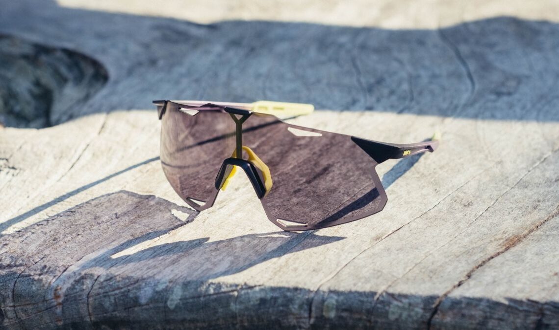
Design and aesthetics
I’ve never sat in on a meeting of designers. I imagine it’s much like any other meeting, with one poor soul up front with a flipboard of terrible quality paper and some coloured pens that are a little too dry for the task at hand. Fortunately, the designated scribe in this case will have only had to write one word: Angles.
Other than the curve of the lens and the arms in order to wrap around the face I’ve been unable to find a single organic line on these cycling glasses. It’s all angles; the lens is a complex polygon with lower tabs jutting above the cheekbones, arm tabs that extend out from the upper reaches, and triangular cutouts above and below the eyes. In order to negate the usually delicate arch at the top of the lens, there is a central plateau, beset on both sides by triangular ramps too.
The arms, protruding as they do from the top corners, haven’t been spared either. They are sculpted and shaped to match, with hollowed-out front sections and slightly wider rears with grippy pads. It all adds up to produce a striking, rather waspish package that sits at the polar opposite end of the spectrum to something like the POC Aspire in terms of aesthetics.
In this model, I’ve been treated to a purple-tinted lens, with a black/purple/neon yellow fade on the arms and a neon yellow nose gripper. There’s a tiny 100% logo, also in neon green on the arms, but given how spindly they are, there isn’t much real estate for large logos.
All things considered, I quite like how they look. They’re striking, but not overly so with this purple…
Click Here to Read the Full Original Article at CyclingNews RSS Feed…