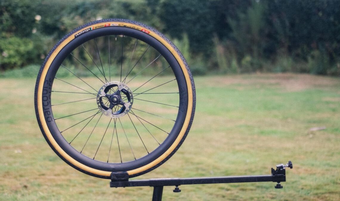
Getting your first pair of carbon wheels is one of the landmark purchases in any cyclists life. It’s a lot further down the line usually than getting clipless pedals or lycra shorts, and for some of us it is one of those purchases that’s just over the horizon. Maybe when you see the prices for the best gravel wheelsets it’s not hard to see why. The Parcours Alta gravel wheels, here in a new iteration compared to the 650b set we reviewed recently, represent a slightly more attainable entry point compared to the premium offerings from brands like Zipp, Roval, Cadex et al that make up the most part of our list of the best gravel wheelsets.
Is more mid-range carbon a good choice then? Well, I’ve been running these wheels with a range of tyre options to update our list of the best gravel tyres. I’ve done fast summer gravel miles through to more recent excursions through slop, and over rocks and roots. Read on to find out how they have held up, and whether or not you should part with your cash and buy a set.
Design and aesthetics
While I’m sure we have all pretended that performance is always the number one metric that’s considered when making a purchase, I like to start with aesthetics. Wheels, gravel or otherwise, have visually matured somewhat over the last handful of years. Even the brasher branding of Zipp and Hed (to name just two) has been toned down a smidge from the giant logos of yesteryear. At the other end of the spectrum, newer brands without such an established brand identity have been able to play around with extremely minimalist aesthetics. Hunt and Reserve spring to mind here, as does Parcours.
If you’re not going to slap large logos on the rim sidewalls, there’s not a great deal of other options to play with. Parcours opts to use a black-on-black scheme, playing with texture rather than colour. The rims themselves are flat, matte black, though devoid of the raw carbon look that some other matte options offer, while the logos are a high gloss, with a slight glitter flake to the gloss coat that you only really notice in direct light. I’m not a fan of having big logos everywhere on my bikes, so I am consequently quite fond of the aesthetic package here. My only slight bugbear is that the logos don’t align with the valve, but that’s hardly a criticism that’s going to hold you back from a purchase…
Click Here to Read the Full Original Article at CyclingNews RSS Feed…

